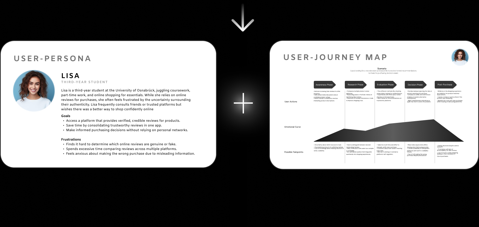
Fake reviews and bots make online shopping frustrating. The solution: A safe space with real users & reviews plus a clean design for more clarity to find great products.
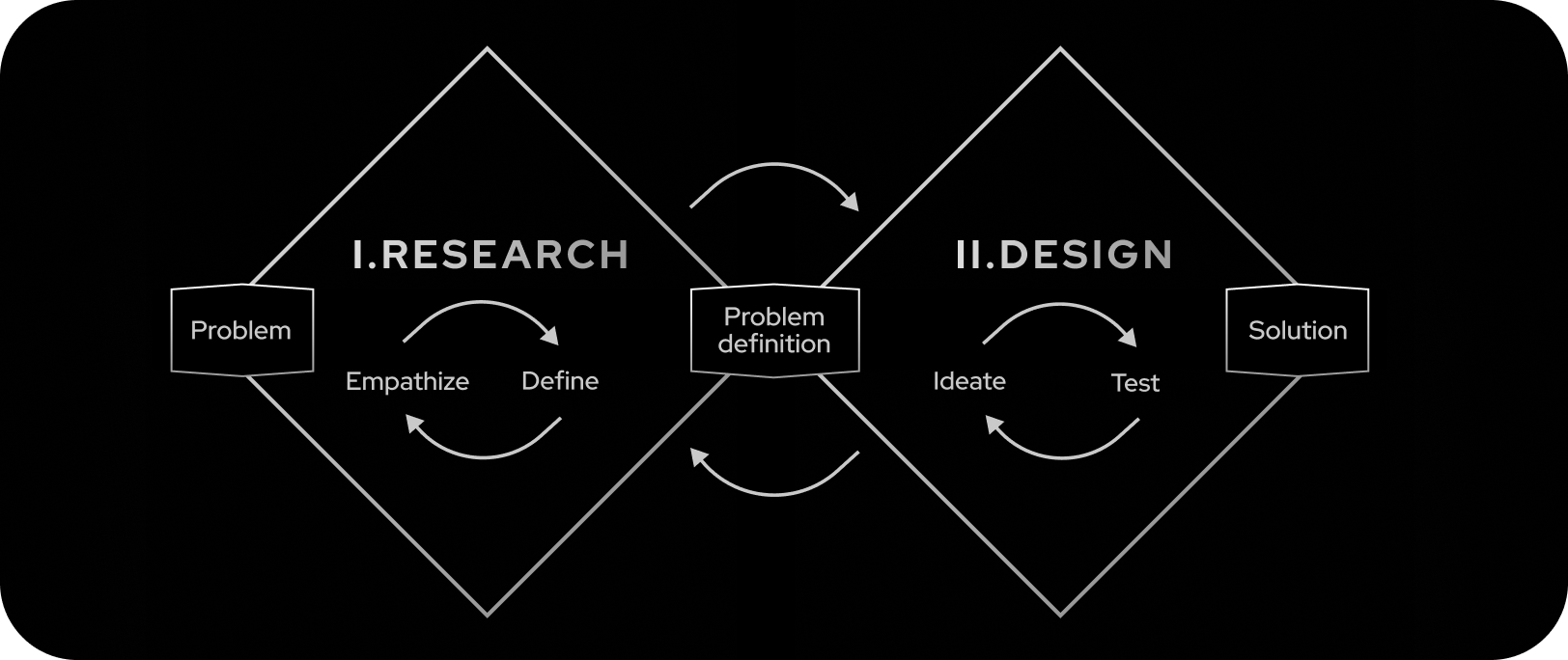
In a team of two, where my teammate focused more on the coding part, I led research, design, and prototyping/testing phases, using the design thinking process – #Double Diamond . I incorporated the #ISO’s 9241-110 dialogue principles and #Don Norman's fundamental design principles as well as the #Heuristics by Jakob Nielsen . Alongside the prototype, we built parts of the app using Ionic, web scraping, and Firebase OTP. (University project)


Analysis of average values and standard deviations for each dimension.
Reliability Mean = –1.1 (SD = 0.7) → indicates low perceived trustworthiness.
Clarity Mean = +1.3 (SD = 0.6) → shows strong desire for transparency.
Efficiency Mean = +0.4 (SD = 0.8) → moderate ease of use.


Usability testing with mixed methods: Eyetracking & Thinking Aloud + SUS & AttrakDiff.
Mean SUS score 84/100 → indicates high usability and ease of navigation.
“Navigation felt intuitive and tasks were easy to complete.”
“I could find what I needed without getting lost or confused.”

Hedonic Quality (stimulation & motivation) Mean = +1.8/3 → users enjoyed interactive features like “Spotlights” and “Glorified Products”.
Pragmatic Quality (efficiency & controllability) Mean = +1.4/3 → app perceived as functional and responsive.
Attractiveness Mean = +2.0/3 → design considered professional, appealing, and modern.
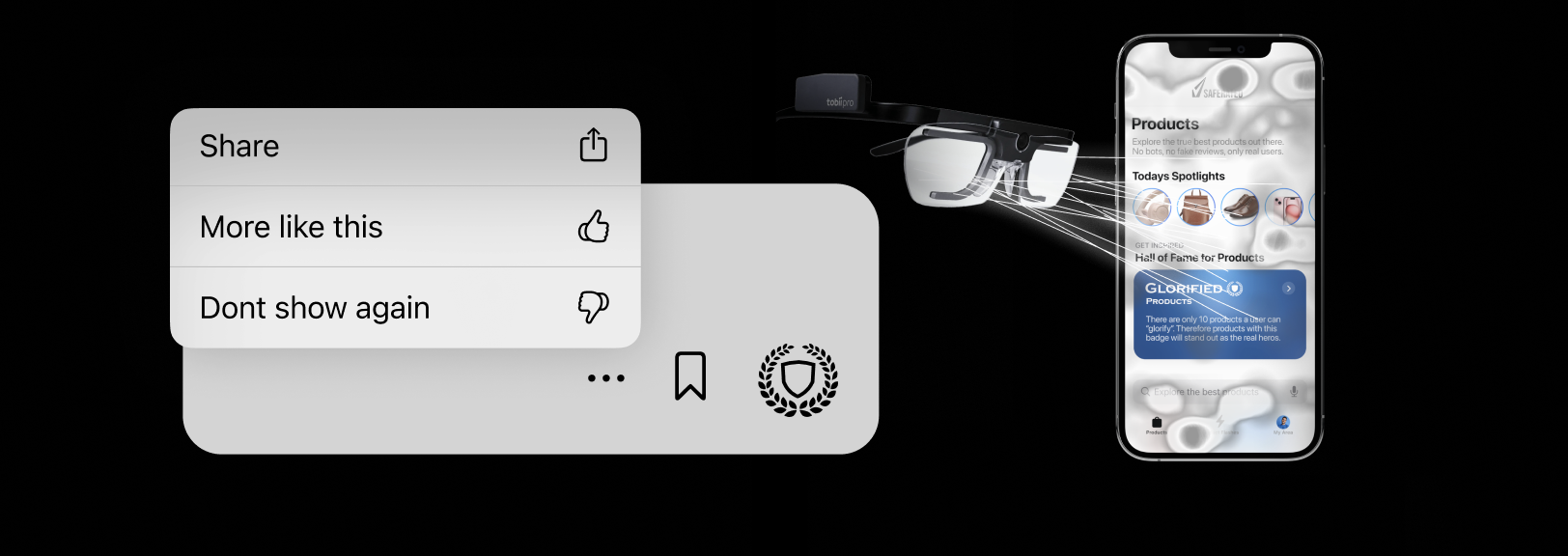
Problem example: Difficulty finding product options such as “Share” or “Save”. “Scan behavior” and expressed confusion.
Improvement example: Integration of more product options like "save", "like" or "share". #Don Norman_Mental Model Alignment


We developed parts of the app using Ionic and Angular with features like Firebase Authentication and web scraping. Here are some key insights from the process.
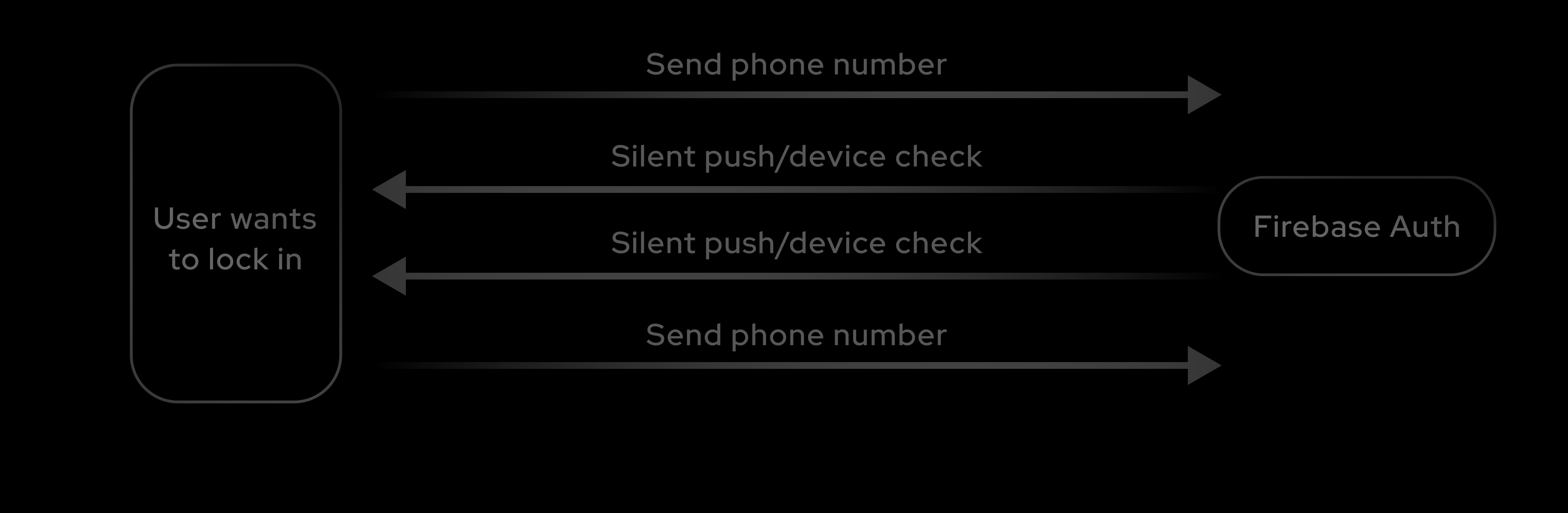
For secure user registration, we used phone number OTP verification. This ensures users are authenticated securely via a one-time password sent to their phone. Once the OTP is verified, user data is securely saved.
firebase.auth().signInWithPhoneNumber(this.phoneNumber, this.recaptchaVerifier)
    .then((confirmationResult) => {
        this.confirmationResult = confirmationResult;
    });
To verify user credibility, we integrated ScraperAPI, which scrapes public data from platforms like LinkedIn. This data helps assign a trust level to users based on their online presence.
fetchSearchResults() {
    this.apiService.getResults(this.username).subscribe(response => {
        this.results = response;
        this.updateTrustLevel();
    });
}
updateTrustLevel() {
    if (this.results.length > 50) this.trustLevel = 5;
    else if (this.results.length > 20) this.trustLevel = 4;
}
Challenge: The initial coded version didn’t fully match the Figma design.
Learning: Frequent, focused check-ins helped bridge the gap — I learned that clear feedback is essential to deliver pixel-level consistency.
Challenge: Letting go of design directions I personally liked after negative feedback.
Learning: Embracing user feedback – even when it contradicts my preferences – led to better, more user-centered outcomes.
Challenge: In discussions, I sometimes held back my opinion to avoid unnecessary friction – even when I had strong design reasoning.
Learning: Respectful disagreement can actually build trust and lead to better, more thoughtful team decisions.